

- cross-posted to:
- programmer_humor@programming.dev
- cross-posted to:
- programmer_humor@programming.dev
So, which butthole did you pull your code, copy, or image from today? 🙂
You must log in or register to comment.
I can’t stop laughing.
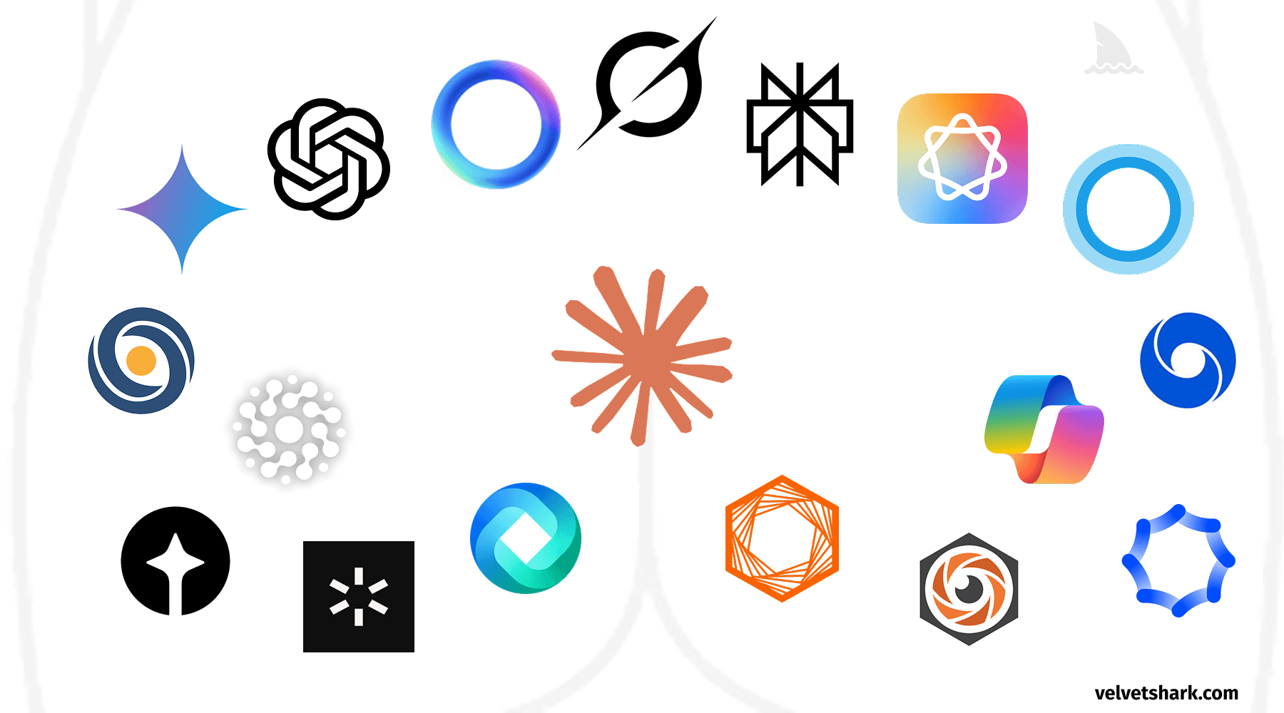
No single person suggests making a logo that resembles an anus, but when everyone’s feedback gets incorporated, that’s what often emerges.
- 1990s-2000s: 3D and Glossy - Remember when every logo needed a drop shadow and a glassy shine? Apple’s aqua interface set the standard.
- 2010-2013: Skeuomorphism - Digital designs mimicking physical objects, with stitched leather textures and realistic dials.
- 2013-2018: Flat Design - Reaction to skeuomorphism brought minimal, clean interfaces with bright colors and no shadows.
- 2018-2022: Neomorphism - Soft shadows and semi-flat design creating subtle, “touchable” interfaces.
- 2022-Present: The Butthole Era
Somehow Walmart is leading innovation, launching a butthole logo in '07. Truly ahead of their time.
I give this post 3.5 buttholes.