Belowland
  • Communities
  • Create Post
  • heart
    Support Lemmy
  • search
    Search
  • Login
  • Sign Up
Gregor to Memes@lemmy.ml • 1 year ago

I hate these icons

gregtech.eu

message-square
187
fedilink
1.54K

I hate these icons

gregtech.eu

Gregor to Memes@lemmy.ml • 1 year ago
message-square
187
fedilink
alert-triangle
You must log in or register to comment.
  • NutWrench
    link
    fedilink
    20•1 year ago

    Not Google related, but whoever decide that the best color scheme for an Office suite should be light grey text on a white background deserves to be flogged.

  • @No_Support_8363@lemm.ee
    link
    fedilink
    1•1 year ago

    To be honest the maps and the meets icons look better

  • @linkhidalgogato@lemmy.ml
    link
    fedilink
    4•1 year ago

    Its one of those things u never think about as a person without disabilities, cuz i can tell the difference just fine, i guess they should have consulted someone with a vision impairment when considering stuff like this.

  • @SlopppyEngineer@lemmy.world
    link
    fedilink
    14•1 year ago

    I’ll keep using my favorite icon pack instead, thank you very much

    • @Martin2789@lemmy.world
      link
      fedilink
      English
      2•1 year ago

      which do you use ? i am looking for a good one

      • 𝕾𝖕𝖎𝖈𝖞 𝕿𝖚𝖓𝖆
        link
        fedilink
        English
        3•1 year ago

        I use Flat Circle. It’s not free, though.

      • @SlopppyEngineer@lemmy.world
        link
        fedilink
        5•1 year ago

        Poppin, Olympia, Cyber, Minima and/or Outline, depending on the mood, season and launcher. There isn’t much left on factory spec with my phone.

  • @coffee_with_cream@sh.itjust.works
    link
    fedilink
    3•1 year ago

    Yeah this is the worst! You know a few designers raised this exact problem during review, too, and were shut down

  • @eleefece@lemmy.world
    link
    fedilink
    39•
    edit-2
    1 year ago

    [It could be sooo easy to solve, but noooo…

    It could be sooo easy to solve, but noooo...

    • Trailblazing Braille Taser
      link
      fedilink
      13•1 year ago

      Without the distracting colors, now I can see this says MAPOD

  • 🏴 hamid the villain [he/him] 🏴
    link
    fedilink
    14•1 year ago

    deleted by creator

    • @GingeyBook@lemm.ee
      link
      fedilink
      37•
      edit-2
      1 year ago

      Bro what

      • @ILikeBoobies@lemmy.ca
        link
        fedilink
        14•1 year ago

        Damn, my 30s flew by if 2020 was 10 years ago

      • @FUsername@feddit.org
        link
        fedilink
        Deutsch
        2•
        edit-2
        1 year ago

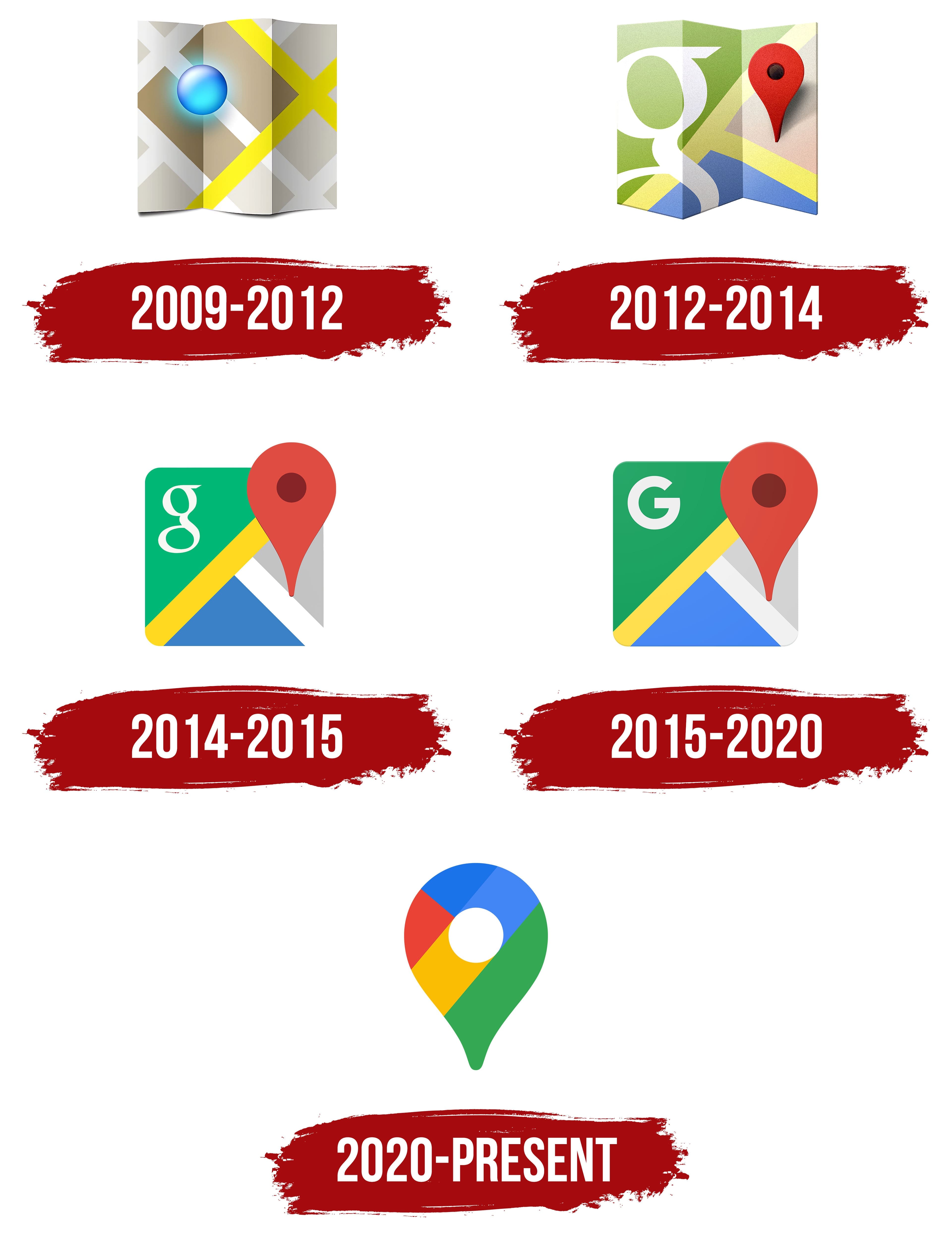
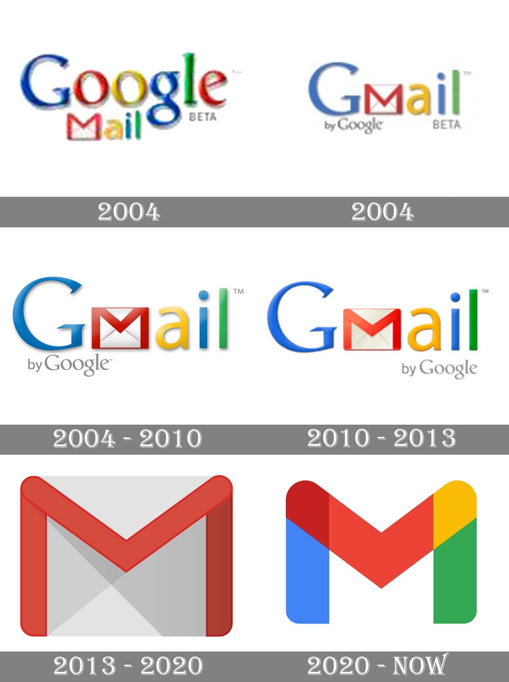
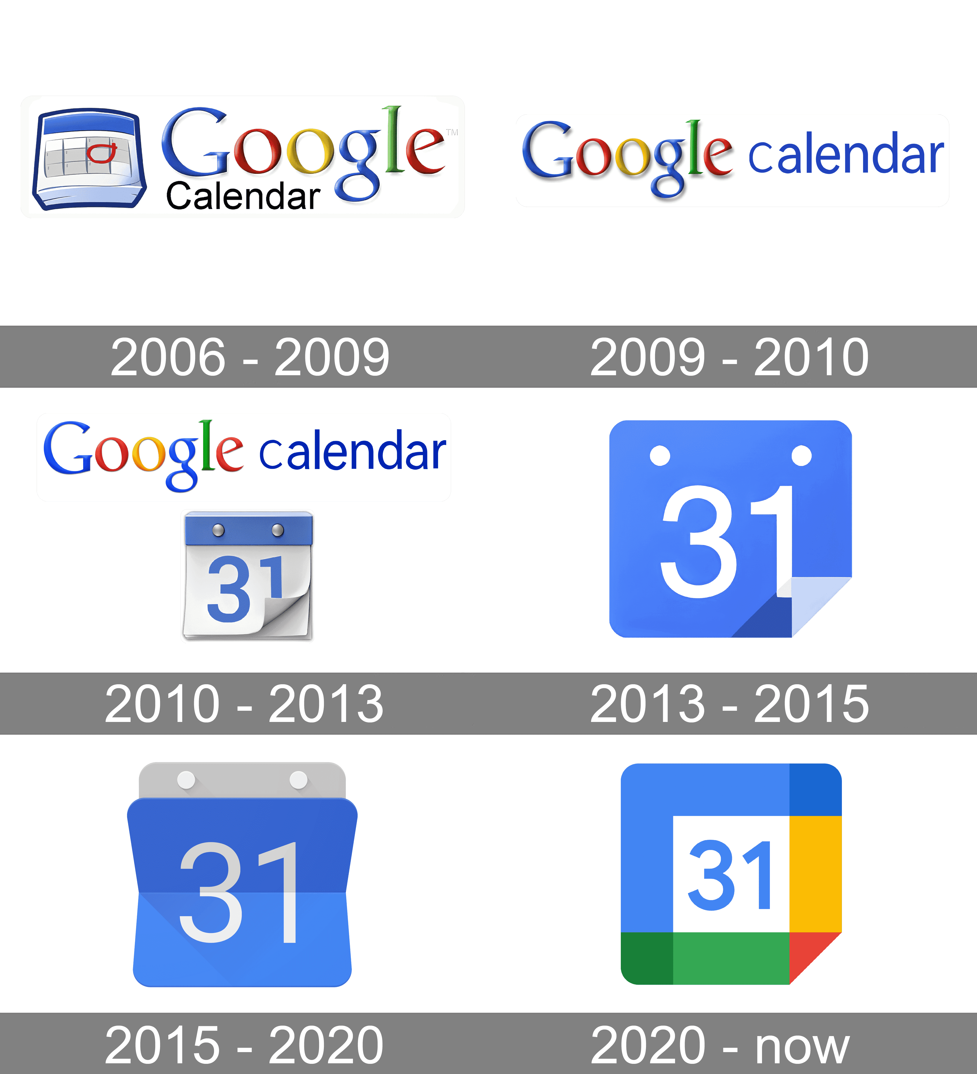
        Ok so for me it’s the 2012 maps logo, the 2013 gmail and the 2015 calendar logo.

      • 🏴 hamid the villain [he/him] 🏴
        link
        fedilink
        1•1 year ago

        deleted by creator

  • @_lilith@lemmy.world
    link
    fedilink
    1•1 year ago

    deleted by creator

  • @kylie_kraft@lemmy.world
    link
    fedilink
    3•1 year ago

    deleted by creator

  • kamen
    link
    fedilink
    English
    6•1 year ago

    Custom icon packs for the win!

  • @jol@discuss.tchncs.de
    link
    fedilink
    11•1 year ago

    There’s always a yoyo effect with design. I fully expect Google to swing back to gothic palette and highly detailed icon within the next decade.

  • @Prunebutt@slrpnk.net
    link
    fedilink
    143•
    edit-2
    1 year ago

    It’s not even more aesthetic. Just more unified in branding.

    • Ephera
      link
      fedilink
      8•1 year ago

      I think what really bothers me about the aesthetics is that the shapes are broken up by the coloration. For example, the pin icon for Google Maps looks almost like a hook, because the yellow has little contrast on this white background.

    • pewpew
      link
      fedilink
      54•1 year ago

      And the interface of their apps are still incoherent af. I don’t know how, but they manage to make things worse every time

      • @AnUnusualRelic@lemmy.world
        link
        fedilink
        English
        27•1 year ago

        It’s ok, they’ll just retire the service eventually.

    • magic_lobster_party
      link
      fedilink
      26•1 year ago

      Yeah, the old logos were all over the place. At first glance it’s not obvious they’re all Google apps.

      • @jmcs@discuss.tchncs.de
        link
        fedilink
        33•1 year ago

        And? All of those being part of the same walled garden is a bug in the legal system not a feature.

        • magic_lobster_party
          link
          fedilink
          16•1 year ago

          Better be explicit about the walled garden rather than being diffuse about it

      • @Prunebutt@slrpnk.net
        link
        fedilink
        13•1 year ago

        To me, that’s just the case for camera and calendar. Maps is IMHO perfect (except the unnecessary G) and the red-and-white envelope is quite well-known.

    • Victor
      link
      fedilink
      2•1 year ago

      Whatever. It sucks ass is the point.

      • @Prunebutt@slrpnk.net
        link
        fedilink
        7•1 year ago

        My point is that it’s also ugly.

    • @SuperSaiyanSwag@lemmy.zip
      link
      fedilink
      English
      3•1 year ago

      And that’s why I don’t really hate it. I hate Google, but I think it’s a neat design choice. I still hate Microsoft’s icon design a lot though, they can’t seem to stick with one thing.

    • @where_am_i@sh.itjust.works
      link
      fedilink
      2•1 year ago

      I definitely find it more aesthetically pleasing. Just like the icon packs.

  • @LeFantome@programming.dev
    link
    fedilink
    41•
    edit-2
    1 year ago

    Triumph of visual design over interactive design. These days, most “designers” only care about graphics visually. The much deeper science of how people use and understand things is beyond them. Worse, they think the problem is that everybody else does not “get” visual design.

    Style over substance.

    • @JakenVeina@lemm.ee
      link
      fedilink
      English
      6•1 year ago

      Case in point: Every single thing Microsoft is doing in Windows these days.

    • @uis@lemm.ee
      link
      fedilink
      2•1 year ago

      Worse, they think the problem is that everybody else does not “get” visual design.

      This means they didn’t even make good design. Another example is KDE vs GNOME.

      KDE: “We just did system we wanted.”

      GNOME: “No, you don’t get it, this is design!”

  • @Etterra@lemmy.world
    link
    fedilink
    11•
    edit-2
    1 year ago

    Hey show some respect! A whole team of people each racked up tens of thousands of dollars of student loan debt and spent months tweaking their designs, just for upper management to wreck it all on a whim in order to get you those new icons.

  • m-p{3}
    link
    fedilink
    10•1 year ago

    I use an icon pack on Android to revert them to their previous icon, the new ones are indeed terrible…

Memes@lemmy.ml

!memes@lemmy.ml
Create a post
You are not logged in. However you can subscribe from another Fediverse account, for example Lemmy or Mastodon. To do this, paste the following into the search field of your instance: !memes@lemmy.ml

Rules:

  1. Be civil and nice.
  2. Try not to excessively repost, as a rule of thumb, wait at least 2 months to do it if you have to.
  • 42 users / day
  • 324 users / week
  • 1.06K users / month
  • 4.92K users / 6 months
  • 1 subscriber
  • 13.5K Posts
  • 226K Comments
  • Modlog
  • mods:
  • ghost_laptop
  • @sexy_peach@feddit.de
  • Cyclohexane
  • Arthur Besse
  • BE: 0.18.1
  • Modlog
  • Instances
  • Docs
  • Code
  • join-lemmy.org